Tuesday, December 16, 2008


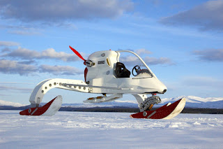
Sci-fi or real life?! This vehicle reminded me of the new bmw gena skin. Not in any physical way, just in the sense of a new body for a vehicle. Kieron Bradley recently designed this “bio-fueld Concept Ice Vehicle” for arctic terrain. From the outside, it reminds me almost of something out of star wars, but the actual idea is brilliant. It basically looks like a helicopter body on extra large snow mobile legs. The design incorporates issues with the weather, such as few moving parts, so things don’t freeze over. I found this to be a neat industrial design, as it makes more sense than anything else out there I’m sure, and it just looks so efficient… it leave me wondering why it hasn’t been thought of before this.

Packaging… it makes more of a difference than people think.In the next few years, I read that McDonalds intends to come out with new packaging, already designed, hoping to change the way that it is perceive..? A design studio called “Boxer”, based in Birmingham was asked to created the new packaging. The new packaging will be more environmentally friendly, using recycleable materials instead of foam boxes. An interesting aspect pointed out in the article that I read was the language used on the new packaging. As used in many food product packaging, McDonalds will aim to put phrases that are considered “salivating language”.It’s interesting all in all. The idea of the environmentally friendly packaging is great. I also find it pretty neat that a stable company would change its overall design. Obviously sleak new design can make a world of difference. We shall see what’s to come
://www.creativereview.co.uk/crblog/mcdonalds-new-packaging-lovin-it/

Just a fun book that I saw recently. As a graphic design student, I could appreciate it, and would like to look into more books like this. It is called “Victor and Susie”. It is designed solely with type, creating characters for a small comic book type childrens book. The article that I read said that Futura was the most common font for the characters. It was designed by Brighten the Corners design group. I love it!

Apparently there was a contest known as the “Gwanggyo City Centre compretition” to design a whole new city just south of Seoul, South Korea. A Rotterdam-based group of architects known as MVRDV won. Thre idea was a to have a a city while virtually was the environment as well. They created these organically shaped buildings that would have terraced levels of grass growing on them. The idea to me is cool. I cant help but think that we are reverting back to ancient societies. This reminded me so much of terrace farming, back when the Incas needed extra farming land in the Andes Mountains. This is taking their idea of “getting more out of their surroundings” and reversing it in a way. We would be taking our surroundings and trying to give more back, if you will. The article that I read outlined that “each floor in the city is lined with lush box hedges that improve ventilation while reducing energy and water usage”. Very neat, and innovative.
http://www.inhabitat.com/2008/12/08/gwanggyo-city-center-by-mvrdv/#more-17223

I have read about this before, and posted an article about a Netherlands revolving door that harnesses kinetic energy, but these concepts are so cool. There is a train station in Tokyo which is part of the “East Japan Railway Company” that harvest kinetic energy as well. They put energy generating floors in, so the kinetic energy generated by the thousands of people in the station every day is actually harnessed and put back into the station. At the moment, the energy is at least used towards powering the signs in the stations, but will be put forth in more and more…
http://www.inhabitat.com/2008/12/11/tokyo-subway-stations-get-piezoelectric-floors/#more-17484

Monday, December 15, 2008


Core77 has posted there 77 gifts under $77 as the holidays are fast approaching and people are looking for that clever little gift idea. One of the items that caught my eye was the BottleBob. It is a device that punches a hole in the top of a coke bottle top, creating a small hole in which a straw can be inserted. I personally love to travel. I have been to third world countries where most coke and other sodas are served in the retro glass bottles. In Mexico one time, I remember buying a soda in a market where they poured the soda into a plastic bag, put a straw in it, and tied up the top. I think this is a clever little design and one that is quite unique.

A new packaging design for gum packs. This is a simple design by Kyle Gati (a designer with his portfolio on Coroflat). There is more and more of this popping up. His design allows each individual pack of gum to attach to the next one with a special type of adhesive, thus eliminating the need for the extreme amounts of plastic that surround the current packages.Good thinking! And something everyone should be doing. My biggest petpeeve is the hard plastic container that surrounds little electrical devices. It a. is WAY too much packaging for such a small item, b. takes up a huge amount of space in general, and c. is the most annoying thing to get open. If you don’t have a pair of scissors then you are out of luck… hopefully someone will eliminate those someday as well.
http://www.coroflot.com/public/individual_file.asp?individual_id=143790&portfolio_id=1025578&specialty=4&sort_by=4&c=1&